
|
Definition and UsageThe The Browser SupportThe numbers in the table specify the first browser version that fully supports the element.
Attributes
Global AttributesThe Event AttributesThe |

How to create HTML <source> Tag
It is An audio player with two source files. The browser will choose the first <source> it supports.
index.html
Example:
HTML
<!DOCTYPE html>
<html>
<body>

<h1>The source element</h1>

<p>Click on the play button to play a sound:</p>

<audio controls>
  <source src="https://file-examples.com/storage/fe36b23e6a66fc0679c1f86/2017/11/file_example_OOG_1MG.ogg" type="audio/ogg">
  <source src="https://file-examples.com/storage/fe36b23e6a66fc0679c1f86/2017/11/file_example_MP3_700KB.mp3" type="audio/mpeg">
  Your browser does not support the audio element.
</audio>

</body>
</html>
Output should be:

How to Use <source> within <video> to play a video
See the Example.
index.html
Example:
HTML
<!DOCTYPE html>
<html>
<body>

<h1>The video element</h1>

<video width="320" height="240" controls>
  <source src="https://www.sample-videos.com/video321/mp4/720/big_buck_bunny_720p_1mb.mp4" type="video/mp4">
  <source src="https://www.sample-videos.com/video321/mp4/720/big_buck_bunny_720p_1mb.mp4" type="video/ogg">
  Your browser does not support the video tag.
</video>

</body>
</html>
Output should be:

How to Use <source> within <picture> to define different images based on the viewport width
See the Eample.
index.html
Example:
HTML
<!DOCTYPE html>
<html>
<head>
<meta name="viewport" content="width=device-width, initial-scale=1.0">
</head>
<body>

<h1>The picture element</h1>

<p>Resize the browser window to load different images.</p>

<picture>
  <source media="(min-width:650px)" srcset="https://horje.com/avatar.png">
  <source media="(min-width:465px)" srcset="https://horje.com/avatar.png">
  <img src="https://horje.com/avatar.png" alt="Horje" style="width:auto;">
</picture>

</body>
</html>
Output should be:

What is HTML <source> media Attribute
Definition and Usage
The media attribute accepts any valid media query that would normally be defined in a CSS.
Note: This attribute can accept several values.
Browser Support
The numbers in the table specify the first browser version that fully supports the attribute.

Syntax
<source media="media_query">
Devices
Value
Description
all
Suitable for all devices. This is default
aural
Speech synthesizers
braille
Braille feedback devices
handheld
Handheld devices (small screen, limited bandwidth)
projection
Projectors
print
Print preview mode/printed pages
screen
Computer screens
tty
Teletypes and similar media using a fixed-pitch character grid
tv
Television type devices (low resolution, limited scroll ability)
Values
Value
Description
width
Specifies the width of the targeted display area.
"min-" and "max-" prefixes can be used.
Example: media="screen and (min-width:500px)"
height
Specifies the height of the targeted display area.
"min-" and "max-" prefixes can be used.
Example: media="screen and (max-height:700px)"
device-width
Specifies the width of the target display/paper.
"min-" and "max-" prefixes can be used.
Example: media="screen and (device-width:500px)"
device-height
Specifies the height of the target display/paper.
"min-" and "max-" prefixes can be used.
Example: media="screen and (device-height:500px)"
orientation
Specifies the orientation of the target display/paper.
Possible values: "portrait" or "landscape"
Example: media="all and (orientation: landscape)"
aspect-ratio
Specifies the width/height ratio of the targeted display area.
"min-" and "max-" prefixes can be used.
Example: media="screen and (aspect-ratio:16/9)"
device-aspect-ratio
Specifies the device-width/device-height ratio of the target display/paper.
"min-" and "max-" prefixes can be used.
Example: media="screen and (aspect-ratio:16/9)"
color
Specifies the bits per color of target display.
"min-" and "max-" prefixes can be used.
Example: media="screen and (color:3)"
color-index
Specifies the number of colors the target display can handle.
"min-" and "max-" prefixes can be used.
Example: media="screen and (min-color-index:256)"
monochrome
Specifies the bits per pixel in a monochrome frame buffer.
"min-" and "max-" prefixes can be used.
Example: media="screen and (monochrome:2)"
resolution
Specifies the pixel density (dpi or dpcm) of the target display/paper.
"min-" and "max-" prefixes can be used.
Example: media="print and (resolution:300dpi)"
scan
Specifies scanning method of a tv display.
Possible values are "progressive" and "interlace".
Example: media="tv and (scan:interlace)"
grid
Specifies if the output device is grid or bitmap.
Possible values are "1" for grid, and "0" otherwise.
Example: media="handheld and (grid:1)"
index.html
Example:
HTML
<!DOCTYPE html>
<html>
<body>

<h1>The source media attribute</h1>

<picture>
  <source media="(min-width: 650px)" srcset="https://horje.com/avatar.png">
  <source media="(min-width: 465px)" srcset="https://horje.com/avatar.png">
  <img src="https://horje.com/avatar.png" alt="Horje Icon" style="width:auto;">
</picture>

</body>
</html>
Output should be:

How to add HTML <source> media Attribute
It is a <picture> element with two source files, and a fallback image.
index.html
Example:
HTML
<!DOCTYPE html>
<html>
<body>

<h1>The source media attribute</h1>

<picture>
  <source media="(min-width: 650px)" srcset="https://horje.com/avatar.png">
  <source media="(min-width: 465px)" srcset="https://horje.com/avatar.png">
  <img src="https://horje.com/avatar.png" alt="Horje Icon" style="width:auto;">
</picture>

</body>
</html>
Output should be:

How to add and Value in HTML <source> media Attribute
| and | Specifies an AND operator |
index.html
Example:
HTML
<!DOCTYPE html>
<html>
<body>

<h1>The source media attribute</h1>

<picture>
  <source media="screen and (min-width:500px)" srcset="https://horje.com/avatar.png">
  <source media="screen and (min-width:500px)" srcset="https://horje.com/avatar.png">
  <img src="https://horje.com/avatar.png" alt="Horje Icon" style="width:auto;">
</picture>

</body>
</html>
Output should be:

How to add not Value in HTML <source> media Attribute
| not | Specifies a NOT operator |
index.html
Example:
HTML
<!DOCTYPE html>
<html>
<body>

<h1>The source media attribute</h1>

<picture>
  <source media="screen not (min-width:500px)" srcset="https://horje.com/avatar.png">
  <source media="screen and (min-width:500px)" srcset="https://horje.com/avatar.png">
  <img src="https://horje.com/avatar.png" alt="Horje Icon" style="width:auto;">
</picture>

</body>
</html>
Output should be:

How to add or/, Value in HTML <source> media Attribute
| , | Specifies an OR operator |
index.html
Example:
HTML
<!DOCTYPE html>
<html>
<body>

<h1>The source media attribute</h1>

<picture>
  <source media="screen not (min-width:500px)" srcset="https://horje.com/avatar.png">
  <source media="screen or (min-width:500px)" srcset="https://horje.com/avatar.png">
  <img src="https://horje.com/avatar.png" alt="Horje Icon" style="width:auto;">
</picture>

</body>
</html>
Output should be:

How to add all Value in HTML <source> media Attribute
| all | Suitable for all devices. This is default |
index.html
Example:
HTML
<!DOCTYPE html>
<html>
<body>

<h1>The source media attribute</h1>

<picture>
  <source media="screen not (min-width:500px)" srcset="https://horje.com/avatar.png">
  <source media="all and (orientation: landscape)" srcset="https://horje.com/avatar.png">
  <img src="https://horje.com/avatar.png" alt="Horje Icon" style="width:auto;">
</picture>

</body>
</html>
Output should be:

How to add aural Value in HTML <source> media Attribute
| aural | Speech synthesizers |
index.html
Example:
HTML
<!DOCTYPE html>
<html>
<body>

<h1>The source media attribute</h1>

<picture>
  <source media="screen not (min-width:500px)" srcset="https://horje.com/avatar.png">
  <source media="all aural (orientation: landscape)" srcset="https://horje.com/avatar.png">
  <img src="https://horje.com/avatar.png" alt="Horje Icon" style="width:auto;">
</picture>

</body>
</html>
Output should be:

How to add braille Value in HTML <source> media Attribute
| braille | Braille feedback devices |
index.html
Example:
HTML
<!DOCTYPE html>
<html>
<body>

<h1>The source media attribute</h1>

<picture>
  <source media="screen not (min-width:500px)" srcset="https://horje.com/avatar.png">
  <source media="braille and (min-width:500px)" srcset="https://horje.com/avatar.png">
  <img src="https://horje.com/avatar.png" alt="Horje Icon" style="width:auto;">
</picture>

</body>
</html>
Output should be:

How to add handheld Value in HTML <source> media Attribute
| handheld | Handheld devices (small screen, limited bandwidth) |
index.html
Example:
HTML
<!DOCTYPE html>
<html>
<body>

<h1>The source media attribute</h1>

<picture>
  <source media="screen not (min-width:500px)" srcset="https://horje.com/avatar.png">
  <source media="handheld and (min-width:500px)" srcset="https://horje.com/avatar.png">
  <img src="https://horje.com/avatar.png" alt="Horje Icon" style="width:auto;">
</picture>

</body>
</html>
Output should be:

How to add projection Value in HTML <source> media Attribute
| projection | Projectors |
index.html
Example:
HTML
<!DOCTYPE html>
<html>
<body>

<h1>The source media attribute</h1>

<picture>
  <source media="screen not (min-width:500px)" srcset="https://horje.com/avatar.png">
  <source media="projection and (min-width:500px)" srcset="https://horje.com/avatar.png">
  <img src="https://horje.com/avatar.png" alt="Horje Icon" style="width:auto;">
</picture>

</body>
</html>
Output should be:

How to add print Value in HTML <source> media Attribute
| Print preview mode/printed pages |
index.html
Example:
HTML
<!DOCTYPE html>
<html>
<body>

<h1>The source media attribute</h1>

<picture>
  <source media="screen not (min-width:500px)" srcset="https://horje.com/avatar.png">
  <source media="print and (min-width:500px)" srcset="https://horje.com/avatar.png">
  <img src="https://horje.com/avatar.png" alt="Horje Icon" style="width:auto;">
</picture>

</body>
</html>
Output should be:

How to add screen Value in HTML <source> media Attribute
| screen | Computer screens |
index.html
Example:
HTML
<!DOCTYPE html>
<html>
<body>

<h1>The source media attribute</h1>

<picture>
  <source media="screen not (min-width:500px)" srcset="https://horje.com/avatar.png">
  <source media="print and (min-width:500px)" srcset="https://horje.com/avatar.png">
  <img src="https://horje.com/avatar.png" alt="Horje Icon" style="width:auto;">
</picture>

</body>
</html>
Output should be:

How to add tty Value in HTML <source> media Attribute
| tty | Teletypes and similar media using a fixed-pitch character grid |
index.html
Example:
HTML
<!DOCTYPE html>
<html>
<body>

<h1>The source media attribute</h1>

<picture>
  <source media="screen not (min-width:500px)" srcset="https://horje.com/avatar.png">
  <source media="tty and (min-width:500px)" srcset="https://horje.com/avatar.png">
  <img src="https://horje.com/avatar.png" alt="Horje Icon" style="width:auto;">
</picture>

</body>
</html>
Output should be:

How to add tv Value in HTML <source> media Attribute
| tv | Television type devices (low resolution, limited scroll ability) |
index.html
Example:
HTML
<!DOCTYPE html>
<html>
<body>

<h1>The source media attribute</h1>

<picture>
  <source media="screen not (min-width:500px)" srcset="https://horje.com/avatar.png">
  <source media="tv and (min-width:500px)" srcset="https://horje.com/avatar.png">
  <img src="https://horje.com/avatar.png" alt="Horje Icon" style="width:auto;">
</picture>

</body>
</html>
Output should be:

How to add width Value in HTML <source> media Attribute
| width | Specifies the width of the targeted display area. "min-" and "max-" prefixes can be used. Example: media="screen and (min-width:500px)" |
index.html
Example:
HTML
<!DOCTYPE html>
<html>
<body>

<h1>The source media attribute</h1>

<picture>
  <source media="screen not (min-width:500px)" srcset="https://horje.com/avatar.png">
  <source media="screen and (min-width:500px)" srcset="https://horje.com/avatar.png">
  <img src="https://horje.com/avatar.png" alt="Horje Icon" style="width:auto;">
</picture>

</body>
</html>
Output should be:

How to add height Value in HTML <source> media Attribute
| height | Specifies the height of the targeted display area. "min-" and "max-" prefixes can be used. Example: media="screen and (max-height:700px)" |
index.html
Example:
HTML
<source media="screen and (max-height:700px)" srcset="https://horje.com/avatar.png">
Output should be:

How to add device-width Value in HTML <source> media Attribute
| device-width | Specifies the width of the target display/paper. "min-" and "max-" prefixes can be used. Example: media="screen and (device-width:500px)" |
index.html
Example:
HTML
<source media="screen and (device-width:500px)" srcset="https://horje.com/avatar.png">
Output should be:

How to add device-height Value in HTML <source> media Attribute
| device-height | Specifies the height of the target display/paper. "min-" and "max-" prefixes can be used. Example: media="screen and (device-height:500px)" |
index.html
Example:
PHP
<source media="screen and (device-height:500px)" srcset="https://horje.com/avatar.png">
Output should be:

How to add orientation Value in HTML <source> media Attribute
| orientation | Specifies the orientation of the target display/paper. Possible values: "portrait" or "landscape" Example: media="all and (orientation: landscape)" |
index.html
Example:
HTML
<source media="all and (orientation: landscape)" srcset="https://horje.com/avatar.png">
Output should be:

How to add aspect-ratio Value in HTML <source> media Attribute
| aspect-ratio | Specifies the width/height ratio of the targeted display area. "min-" and "max-" prefixes can be used. Example: media="screen and (aspect-ratio:16/9)" |
index.html
Example:
HTML
<source media="screen and (aspect-ratio:16/9)" srcset="https://horje.com/avatar.png">
Output should be:

How to add device-aspect-ratio Value in HTML <source> media Attribute
| device-aspect-ratio | Specifies the device-width/device-height ratio of the target display/paper. "min-" and "max-" prefixes can be used. Example: media="screen and (aspect-ratio:16/9)" |
index.html
Example:
HTML
<source media="screen and (aspect-ratio:16/9)" srcset="https://horje.com/avatar.png">
Output should be:

How to add color Value in HTML <source> media Attribute
| color | Specifies the bits per color of target display. "min-" and "max-" prefixes can be used. Example: media="screen and (color:3)" |
index.html
Example:
HTML
<source media="screen and (color:3)" srcset="https://horje.com/avatar.png">

How to add color-index Value in HTML <source> media Attribute
| color-index | Specifies the number of colors the target display can handle. "min-" and "max-" prefixes can be used. Example: media="screen and (min-color-index:256)" |
index.html
Example:
HTML
<source media="screen and (min-color-index:256)" srcset="https://horje.com/avatar.png">
Output should be:

How to add monochrome Value in HTML <source> media Attribute
| monochrome | Specifies the bits per pixel in a monochrome frame buffer. "min-" and "max-" prefixes can be used. Example: media="screen and (monochrome:2)" |
index.html
Example:
HTML
<source media="screen and (min-color-index:256)" srcset="https://horje.com/avatar.png">
Output should be:

How to add resolution Value in HTML <source> media Attribute
| resolution | Specifies the pixel density (dpi or dpcm) of the target display/paper. "min-" and "max-" prefixes can be used. Example: media="print and (resolution:300dpi)" |
index.html
Example:
HTML
<source media="print and (resolution:300dpi)" srcset="https://horje.com/avatar.png">
Output should be:

How to add scan Value in HTML <source> media Attribute
| scan | Specifies scanning method of a tv display. Possible values are "progressive" and "interlace". Example: media="tv and (scan:interlace)" |
<source media="tv and (scan:interlace)" srcset="https://horje.com/avatar.png">
Output should be:

How to add grid Value in HTML <source> media Attribute
| grid | Specifies if the output device is grid or bitmap. Possible values are "1" for grid, and "0" otherwise. Example: media="handheld and (grid:1)" |
index.html
Example:
HTML
<source media="handheld and (grid:1)" srcset="https://horje.com/avatar.png">
Output should be:

How to add HTML <source> size Attribute
| sizes | Specifies image sizes for different page layouts |
index.html
Example:
HTML
<picture>
  <source srcset="https://horje.com/avatar.png 120w,
                  https://horje.com/avatar.png 193w,
                  https://horje.com/avatar.png 278w"
          sizes="(max-width: 710px) 120px,
                 (max-width: 991px) 193px,
                 278px">

  <img src="https://horje.com/avatar.png" alt="Gust">
</picture>
Output should be:

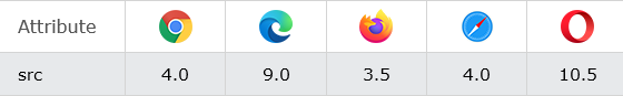
How to add HTML <source> src Attribute
Definition and Usage
The src attribute specifies the URL of the media file to play.
This attribute is required when <source> is used in <audio> and <video>.
Browser Support
The numbers in the table specify the first browser version that fully supports the attribute.

Syntax
<source src="URL">
Attribute Values
| Value | Description |
|---|---|
| URL | Specifies the URL of the media file.
Possible values:
|
index.html
Example:
HTML
<audio controls>
  <source src="https://file-examples.com/storage/fe36b23e6a66fc0679c1f86/2017/11/file_example_OOG_1MG.ogg" type="audio/ogg">
  <source src="https://file-examples.com/storage/fe36b23e6a66fc0679c1f86/2017/11/file_example_MP3_700KB.mp3" type="audio/mpeg">
  Your browser does not support the audio element.
</audio>
Output should be:

How to add HTML <source> srcset Attribute
Definition and Usage
The srcset attribute specifies the URL of the image to use in different situations.
This attribute is required when <source> is used in <picture>.
Browser Support
The numbers in the table specify the first browser version that fully supports the attribute.
Syntax
<source srcset="URL">
Attribute Values
| Value | Description |
|---|---|
| URL | Specifies the URL of the image.
Possible values:
|
index.html
Example:
HTML
<source media="screen and (min-color-index:256)" srcset="https://horje.com/avatar.png">
Output should be:

How to add HTML <source> type Attribute
Definition and Usage
The type attribute specifies the Internet media type (formerly known as MIME type) of the media resource.
Browser Support
The numbers in the table specify the first browser version that fully supports the attribute.

Syntax
<source type="media_type">
Attribute Values
| Value | Description |
|---|---|
| media_type | Specifies the Internet media type of the media resource. Common media types: For video:
|
index.html
Example:
HTML
<!DOCTYPE html>
<html>
<body>

<h1>The video element</h1>

<video width="320" height="240" controls>
  <source src="https://www.sample-videos.com/video321/mp4/720/big_buck_bunny_720p_1mb.mp4" type="video/mp4">
  <source src="https://www.sample-videos.com/video321/mp4/720/big_buck_bunny_720p_1mb.mp4" type="video/ogg">
  Your browser does not support the video tag.
</video>

</body>
</html>
Output should be:

| html source |
Type: | Develop |
Category: | Web Tutorial |
Sub Category: | HTML Tag |
Uploaded by: | Admin |
Reffered: https://www.geeksforgeeks.org/html-source-tag/