Tips (Total 19)
# Tips-1) What is HTML accesskey Attribute
Definition and Usage
The accesskey attribute specifies a shortcut key to activate/focus an element.
The accesskey attribute value must be a single character (a letter or a digit).
Warning
Using accesskeys is difficult because they may conflict with other key standards in the browser.
To avoid this problem, most browsers will use accesskeys only if pressed together with the Alt key.
Concerns
Adapting accesskeys to all international languages are difficult.
The accesskey value may not be present on all keyboards.
Because of these concerns, it is advised not to use accesskeys.
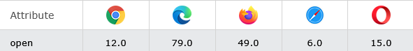
Browser Support
How to add Two hyperlinks with specified accesskeys - HTML Global Attributes
The accesskey attribute specifies a shortcut key to activate/focus an element.
Note: The shortcut is varying in different browsers:
- Edge, IE, Chrome, Safari, Opera 15+: [ALT] + accesskey
- Opera prior version 15: [SHIFT] [ESC] + accesskey
- Firefox: [ALT] [SHIFT] + accesskey
index.html
Example:
HTML
<a href="https://horje.com" accesskey="h">HTML tutorial</a><br>
<a href="https://horje.com/learn/1012/what-is-html-accesskey-attribute" accesskey="c">CSS tutorial</a>
Output should be:

# Tips-2) What is HTML class Attribute
Definition and Usage
The class attribute specifies one or more class names for an element.
The class attribute is mostly used to point to a class in a style sheet. However, it can also be used by a JavaScript (via the HTML DOM) to make changes to HTML elements with a specified class.
Browser Support
Syntax
<element class="classname">
Attribute Values
| Value | Description |
|---|---|
| classname | Specifies one or more class names for an element. To specify multiple classes, separate the class names with a space, e.g. <span class="left important">. This allows you to combine several CSS classes for one HTML element.
Naming rules:
|
How to Use of the class attribute in an HTML document -
Note that this is an important paragraph. :)
index.html
Example:
HTML
<!DOCTYPE html>
<html>
<head>
<style>
h1.intro {
color: blue;
}
p.important {
color: green;
}
</style>
</head>
<body>
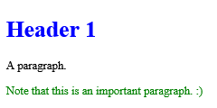
<h1 class="intro">Header 1</h1>
<p>A paragraph.</p>
<p class="important">Note that this is an important paragraph. :)</p>
</body>
</html>
Output should be:
How to add Add multiple classes to one HTML element
See the Example.
index.html
Example:
HTML
<!DOCTYPE html>
<html>
<head>
<style>
h1.intro {
color: blue;
text-align: center;
}
.important {
background-color: yellow;
}
</style>
</head>
<body>
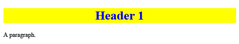
<h1 class="intro important">Header 1</h1>
<p>A paragraph.</p>
</body>
</html>
Output should be:
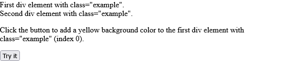
How to use JavaScript to add a yellow background color to the first element with class="example" (index 0)
First div element with class="example". Second div element with class="example". Click the button to add a yellow background color to the first div element with class="example" (index 0).
index.html
Example:
HTML
<!DOCTYPE html>
<html>
<body>

<div class="example">First div element with class="example".</div>
<div class="example">Second div element with class="example".</div>

<p>Click the button to add a yellow background color to the first div element with class="example" (index 0).</p>

<button onclick="myFunction()">Try it</button>

<script>
function myFunction() {
  let x = document.getElementsByClassName("example");
  x[0].style.backgroundColor = "yellow";
}
</script>

</body>
</html>
Output should be:
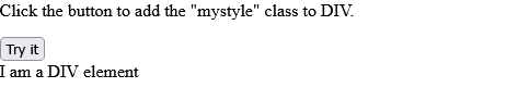
How to use JavaScript to add the "mystyle" class to an element with id="myDIV"
Click the button to add the "mystyle" class to DIV. I am a DIV element
index.html
Example:
HTML
<!DOCTYPE html>
<html>
<head>
<style>
.mystyle {
  margin: 20px;
  width: 300px;
  height: 50px;
  background-color: coral;
  color: white;
  font-size: 25px;
}
</style>
</head>
<body>

<p>Click the button to add the "mystyle" class to DIV.</p>

<button onclick="myFunction()">Try it</button>

<div id="myDIV">
I am a DIV element
</div>
<br>

<script>
function myFunction() {
  document.getElementById("myDIV").classList.add("mystyle");
}
</script>

</body>
</html>
Output should be:
# Tips-3) What is HTML contenteditable Attribute
Definition and Usage
The contenteditable attribute specifies whether the content of an element is editable or not.
Note: When the contenteditable attribute is not set on an element, the element will inherit it from its parent.
Browser Support
The numbers in the table specify the first browser version that fully supports the attribute.

Syntax
<element contenteditable="true|false">
Attribute Values
| Value | Description |
|---|---|
| true | Specifies that the element is editable |
| false | Specifies that the element is not editable |
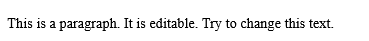
How to add An editable paragraph
This is a paragraph. It is editable. Try to change this text.
index.html
Example:
HTML
<!DOCTYPE html>
<html>
<body>

<p contenteditable="true">This is a paragraph. It is editable. Try to change this text.</p>

</body>
</html>
Output should be:
# Tips-4) What is HTML data-* Attributes
Definition and Usage
The data-* attributes is used to store custom data private to the page or application.
The data-* attributes gives us the ability to embed custom data attributes on all HTML elements.
The stored (custom) data can then be used in the page's JavaScript to create a more engaging user experience (without any Ajax calls or server-side database queries).
The data-* attributes consist of two parts:
- The attribute name should not contain any uppercase letters, and must be at least one character long after the prefix "data-"
- The attribute value can be any string
Note: Custom attributes prefixed with "data-" will be completely ignored by the user agent.
Browser Support
The numbers in the table specify the first browser version that fully supports the attribute.

Syntax
<element data-*="somevalue">
Attribute Values
| Value | Description |
|---|---|
| somevalue | Specifies the value of the attribute (as a string) |
How to Use the data-* attribute to embed custom data
Click on a species to see what type it is:
index.html
Example:
HTML
<!DOCTYPE html>
<html>
<head>
<script>
function showDetails(animal) {
  let animalType = animal.getAttribute("data-animal-type");
  alert("The " + animal.innerHTML + " is a " + animalType + ".");
}
</script>
</head>
<body>

<h1>Species</h1>
<p>Click on a species to see what type it is:</p>

<ul>
  <li onclick="showDetails(this)" id="owl" data-animal-type="bird">Owl</li>
  <li onclick="showDetails(this)" id="salmon" data-animal-type="fish">Salmon</li>
  <li onclick="showDetails(this)" id="tarantula" data-animal-type="spider">Tarantula</li>
</ul>

</body>
</html>
Output should be:

# Tips-5) What is HTML dir Attribute
Definition and Usage
The dir attribute specifies the text direction of the element's content.
Browser Support
Syntax
<element dir="ltr|rtl|auto">
Attribute Values
| Value | Description |
|---|---|
| ltr | Default. Left-to-right text direction |
| rtl | Right-to-left text direction |
| auto | Let the browser figure out the text direction, based on the content (only recommended if the text direction is unknown) |
How to add A paragraph with a right-to-left direction - HTML dir Attribute
See Example.
index.html
Example:
HTML
<!DOCTYPE html>
<html>
<body>

<p dir="rtl">Write this text right-to-left!</p>

</body>
</html>
Output should be:

# Tips-6) What is HTML draggable Attribute
Definition and Usage
The draggable attribute specifies whether an element is draggable or not.
Tip: Links and images are draggable by default.
Tip: The draggable attribute is often used in drag and drop operations. Read our HTML Drag and Drop tutorial to learn more.
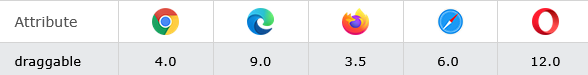
Browser Support
The numbers in the table specify the first browser version that fully supports the attribute.
Syntax
<element draggable="true|false|auto">
Attribute Values
| Value | Description |
|---|---|
| true | Specifies that the element is draggable |
| false | Specifies that the element is not draggable |
| auto | Uses the default behavior of the browser |
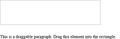
How to add A draggable paragraph
This is a draggable paragraph. Drag this element into the rectangle.
index.html
Example:
HTML
<p draggable="true">This is a draggable paragraph.</p>
Output should be:
How to add A draggable paragraph with true element
This is a draggable paragraph. Drag this element into the rectangle.
index.html
Example:
HTML
<p draggable="true">This is a draggable paragraph.</p>
Output should be:
How to add A draggable paragraph with false element
false - Specifies that the element is not draggable
index.html
Example:
HTML
<p draggable="false">This is a draggable paragraph.</p>
Output should be:
How to add A draggable paragraph with auto element
auto - Uses the default behavior of the browser.
index.html
Example:
HTML
<p draggable="auto">This is a draggable paragraph.</p>
Output should be:
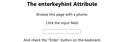
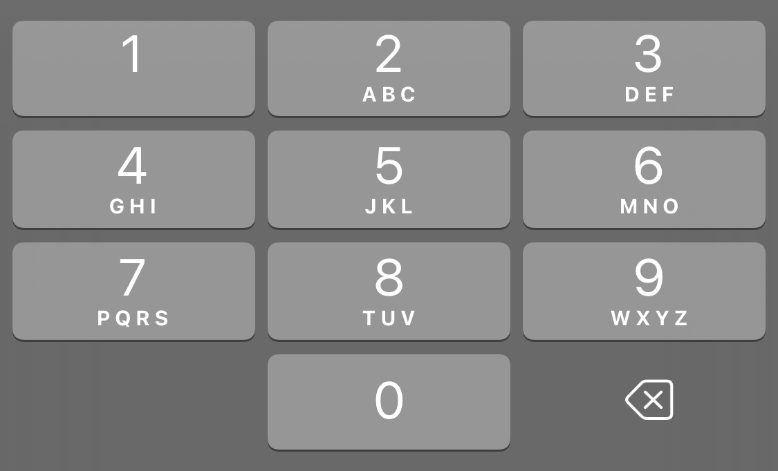
# Tips-7) What is HTML enterkeyhint Attribute
Definition and Usage
The enterkeyhint attribute allows you to change the appearance of the "Enter" key on a virtual keyboard.
Here is the result of the example above, on my phone:

The example below uses "go" as the enter-key:

How to Specify a virtual keyboard's "Enter" button with the enterkeyhint attribute with search Values
search - The enter key says "Search"
index.html
Example:
HTML
<input type="text" enterkeyhint="search">
Output should be:
How to Specify a virtual keyboard's "Enter" button with the enterkeyhint attribute with go Values
go - The enter key says "Go"
index.html
Example:
HTML
<input type="text" enterkeyhint="go">
Output should be:

How to Specify a virtual keyboard's "Enter" button with the enterkeyhint attribute with done Values
done - The enter key says "Done"
index.html
Example:
HTML
<input type="text" enterkeyhint="done">
Output should be:
How to Specify a virtual keyboard's "Enter" button with the enterkeyhint attribute with enter Values
enter - The enter key says "Enter"
index.html
Example:
HTML
<input type="text" enterkeyhint="enter">
Output should be:
How to Specify a virtual keyboard's "Enter" button with the enterkeyhint attribute with next Values
next - The enter key says "Next"
index.html
Example:
HTML
<input type="text" enterkeyhint="next">
Output should be:
How to Specify a virtual keyboard's "Enter" button with the enterkeyhint attribute with previous Values
previous - The enter key says "Previous"
index.html
Example:
HTML
<input type="text" enterkeyhint="previous">
Output should be:
How to Specify a virtual keyboard's "Enter" button with the enterkeyhint attribute with send Values
send - The enter key says "Send"
index.html
Example:
HTML
<input type="text" enterkeyhint="send">
Output should be:
# Tips-8) What is HTML hidden Attribute
Definition and Usage
The hidden attribute is a boolean attribute.
When present, it specifies that an element is not yet, or is no longer, relevant.
Browsers should not display elements that have the hidden attribute specified.
The hidden attribute can also be used to keep a user from seeing an element until some other condition has been met (like selecting a checkbox, etc.). Then, a JavaScript could remove the hidden attribute, and make the element visible.
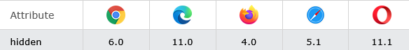
Browser Support
The numbers in the table specify the first browser version that fully supports the attribute.
Syntax
<element hidden>
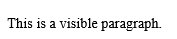
How to add A hidden paragraph
Here gives two examples. 1. This is a visible paragraph. 2. This is a hidden paragraph.
index.html
Example:
HTML
<p hidden>This paragraph should be hidden.</p>
Output should be:
# Tips-9) What is HTML id Attribute
Definition and Usage
The id attribute specifies a unique id for an HTML element (the value must be unique within the HTML document).
The id attribute is most used to point to a style in a style sheet, and by JavaScript (via the HTML DOM) to manipulate the element with the specific id.
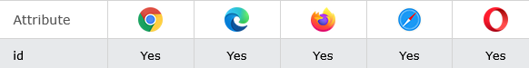
Browser Support
Syntax
<element id="id">
Attribute Values
| Value | Description |
|---|---|
| id | Specifies a unique id for the element. Naming rules:
|
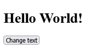
How to Use the id attribute to manipulate text with JavaScript
See id Example.
index.html
Example:
HTML
<!DOCTYPE HTML>
<html>
<body>

<h1 id="myHeader">Hello World!</h1>
<button onclick="displayResult()">Change text</button>

<script>
function displayResult() {
  document.getElementById("myHeader").innerHTML = "Have a nice day!";
}
</script>

</body>
</html>
Output should be:
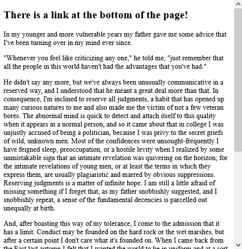
How to Use the id attribute to link to an element with a specified id within a page
There is a link at the bottom of the page!
index.html
Example:
HTML
 <html>
<body>

<h2><a id="top">Some heading</a></h2>

<p>Lots of text....</p>
<p>Lots of text....</p>
<p>Lots of text....</p>

<a href="#top">Go to top</a>

</body>
</html>
Output should be:
How to Use the id attribute to style text with CSS
Id uses to the css and html Style.
index.html
Example:
HTML
<!DOCTYPE HTML>
<html>
<head>
<style>
#myHeader {
  color: red;
  text-align: center;
}
</style>
</head>
<body>

<h1 id="myHeader">Horje is the best!</h1>

</body>
</html>
Output should be:

# Tips-10) What is HTML inert Attribute
Definition and Usage
The inert attribute disables an element and all the elements inside.
The elements are still visible, but they have no function: buttons and links cannot be clicked, input fields are disabled etc., and they are ignored by screen readers.
Browser Support
Syntax
<element inert>
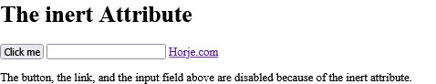
How to Disable a section with the inert attribute
The button, the link, and the input field above are disabled because of the inert attribute.
index.html
Example:
HTML
<div inert>
  <button onclick="alert(42)">Click me</button>
  <input type="text">
  <a href="https://horje.com">Horje.com</a>
</div>
Output should be:
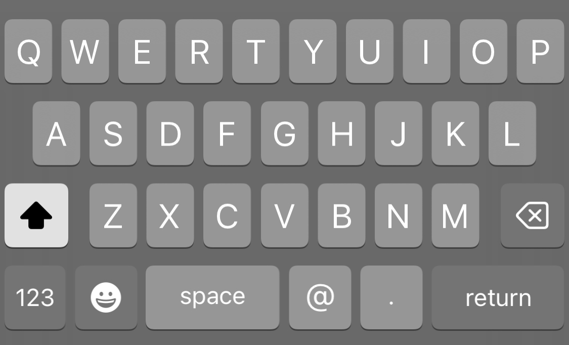
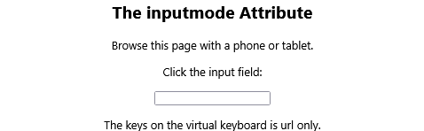
# Tips-11) What is HTML inputmode Attribute
Definition and Usage
The inputmode attribute allows you to change the appearance of the keyboard on a phone or tablet (any device with a virtual keyboard).
Here is the result of the example above, on my phone:
The example below uses inputmode "email":
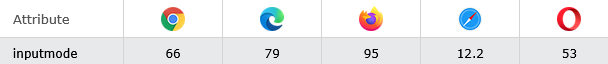
Browser Support
Syntax
<element inputmode="decimal|email|none|numeric|search|tel|text|url">
Attribute Values
| Value | Description |
|---|---|
| decimal | Numeric only keyboard, usually also a comma key |
| Text keyboard, with keys typically for e-mail addresses like [@] | |
| none | No keyboard should appear |
| numeric | Numeric only keyboard |
| search | Text keyboard, usually the [enter] key says [go] |
| tel | Numeric only keyboard, usually also with [+], [*], and [#] keys |
| text | Default. Text keyboard |
| url | Text keyboard, with keys typically for web addresses like [.] and [/], and a special [.com] key, or other domain endings that are typically for the local settings. |
How to Show only numeric keys on the (virtual) keyboard
Run the example with a phone or tablet to see the result.
index.html
Example:
HTML
<input type="text" inputmode="numeric">
Output should be:

How to Show only decimal keys on the (virtual) keyboard
The keys on the virtual keyboard is decimal only.
index.html
Example:
HTML
<input type="text" inputmode="decimal">
Output should be:

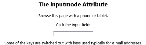
How to Show only email keys on the (virtual) keyboard
Some of the keys are switched out with keys used typically for e-mail addresses.
index.html
Example:
HTML
<input type="text" inputmode="email">
Output should be:
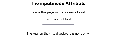
How to Show only none keys on the (virtual) keyboard
| none | No keyboard should appear |
index.html
Example:
HTML
<input type="text" inputmode="none">
Output should be:
How to Show only search keys on the (virtual) keyboard
| search | Text keyboard, usually the [enter] key says [go] |
index.html
Example:
HTML
<input type="text" inputmode="search">
Output should be:

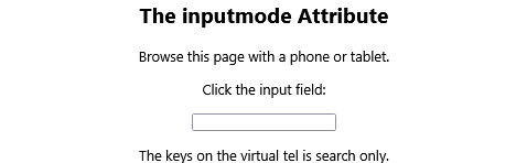
How to Show only tel keys on the (virtual) keyboard
The keys on the virtual tel is search only.
index.html
Example:
HTML
<input type="text" inputmode="tel">
Output should be:

How to Show only text keys on the (virtual) keyboard
The keys on the virtual keyboard is text only.
index.html
Example:
HTML
<input type="text" inputmode="text">
Output should be:
How to Show only url keys on the (virtual) keyboard
The keys on the virtual keyboard is url only.
index.html
Example:
HTML
<input type="text" inputmode="url">
Output should be:
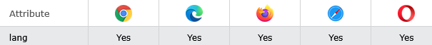
# Tips-12) What is HTML lang Attribute
Definition and Usage
The lang attribute specifies the language of the element's content.
Common examples are "en" for English, "es" for Spanish, "fr" for French, and so on.
Browser Support
Syntax
<element lang="language_code">
Attribute Values
| Value | Description |
|---|---|
| language_code | Specifies the language code for the element's content. Language code reference |
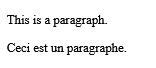
How to add Some French text in a paragraph
This is a paragraph.
index.html
Example:
HTML
<p lang="fr">Ceci est un paragraphe.</p>
Output should be:
# Tips-13) What is HTML popover Attribute
Definition and Usage
The popover attribute defines an element as a popover element, meaning that when it is invoked, it will be placed on top of the content, not interfere with the position of other HTML elements.
A popover element will be invisible until it is invoked by another element. The other element must have a popovertarget attribute where the value refers to the popover element's id.
The popover element will be placed on top of all other content, and by clicking the popovertarget element, the popover element will toggle between showing and hiding:
The popover element can be a single HTML element as in the example above, or an entire section of HTML elements like in the example below.

Syntax
<element popover>
Attribute Values
The popover attribute is a boolean attribute. If it is present, it specifies that this element is a popover element.
How to Add a <h1> element with a popover attribute, and a button to show/hide it
Click the button and it will toggle between showing and hiding the popover element.
index.html
Example:
HTML
<h1 popover id="myheader">Hello</h1>
<button popovertarget="myheader">Click me!</button>
Output should be:

How to Use a DIV element as a popover element
You can style popover elements with CSS. Click the button to show the popover element.
index.html
Example:
HTML
 <div popover id="mydiv">
  <h2>Popover</h2>
  <hr>
  <p>A popover is an element that is placed on top of everything else.</p>
  <p>It can be used when you want to tell something important.</p>
</div>
Output should be:

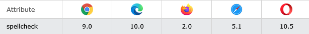
# Tips-14) What is HTML spellcheck Attribute
Definition and Usage
The spellcheck attribute specifies whether the element is to have its spelling and grammar checked or not.
The following can be spellchecked:
- Text values in input elements (not password)
- Text in <textarea> elements
- Text in editable elements
Browser Support
The numbers in the table specify the first browser version that fully supports the attribute.
Syntax
<element spellcheck="true|false">
Attribute Values
| Value | Description |
|---|---|
| true | The element is to have its spelling and grammar checked |
| false | The element is not to be checked |
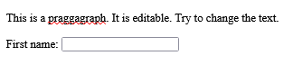
How to add An editable paragraph with spellcheck
This is a praggagraph. It is editable. Try to change the text.
index.html
Example:
HTML
<p contenteditable="true" spellcheck="true">This is a paragraph.</p>
Output should be:
# Tips-15) What is HTML style Attribute
Definition and Usage
The style attribute specifies an inline style for an element.
The style attribute will override any style set globally, e.g. styles specified in the <style> tag or in an external style sheet.
The style attribute can be used on any HTML element (it will validate on any HTML element. However, it is not necessarily useful).
Browser Support

Syntax
<element style="style_definitions">
Attribute Values
| Value | Description |
|---|---|
| style_definitions | One or more CSS properties and values separated by semicolons (e.g. style="color:blue;text-align:center") |
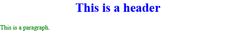
How to Use of the style attribute in an HTML document
Here is a example of HTML Style.
index.html
Example:
HTML
<h1 style="color:blue;text-align:center;">This is a header</h1>
<p style="color:green;">This is a paragraph.</p>
Output should be:
# Tips-16) What is HTML tabindex Attribute
Definition and Usage
The tabindex attribute specifies the tab order of an element (when the "tab" button is used for navigating).
The tabindex attribute can be used on any HTML element (it will validate on any HTML element. However, it is not necessarily useful).
Browser Support
Syntax
<element tabindex="number">
Attribute Values
| Value | Description |
|---|---|
| number | Specifies the tabbing order of the element (1 is first) |
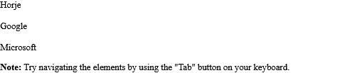
How to add Links with a specified tab order
Note: Try navigating the elements by using the "Tab" button on your keyboard.
index.html
Example:
HTML
<!DOCTYPE html>
<html>
<body>

<div tabindex="1">Horje</div><br>
<div tabindex="3">Google</div><br>
<div tabindex="2">Microsoft</div>

<script>
// At start, set focus on the first div
document.getElementsByTagName('div')[0].focus();
</script>

<p tabindex="4"><b>Note:</b> Try navigating the elements by using the "Tab" button on your keyboard.</p>

</body>
</html>
Output should be:
# Tips-17) What is HTML title Attribute
Definition and Usage
The title attribute specifies extra information about an element.
The information is most often shown as a tooltip text when the mouse moves over the element.
The title attribute can be used on any HTML element (it will validate on any HTML element. However, it is not necessarily useful).
Browser Support
Syntax
<element title="text">
Attribute Values
| Value | Description |
|---|---|
| text | A tooltip text for an element |
How to Use of the title attribute in an HTML document
See the Example.
index.html
Example:
HTML
<!DOCTYPE html>
<html>
<body>
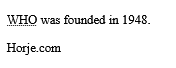
<p><abbr title="World Health Organization">WHO</abbr> was founded in 1948.</p>
<p title="Free Web tutorials">Horje.com</p>
</body>
</html>
Output should be:
# Tips-18) What is HTML translate Attribute
Definition and Usage
The translate attribute specifies whether the content of an element should be translated or not.
Test: Click on the Google translate image (next to the search button at the top of the page) to change to another language, and look what happens to the word "ice cream" below:
Here we use translate="no": ice cream.
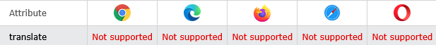
Browser Support
Syntax
<element translate="yes|no">
Attribute Values
| Value | Description |
|---|---|
| yes | Specifies that the content of the element should be translated |
| no | Specifies that the content of the element must not be translated |
How to Specify that some elements should not be translated
See the Example. When you will go to translate in Google. It will show you translate and not translate
index.html
Example:
HTML
 <p translate="no">Don't translate this!</p>
<p>This can be translated to any language.</p>
# Tips-19) What are the HTML Global Attributes
HTML Global Attributes
The global attributes are attributes that can be used with all HTML elements.
| Attribute | Description |
|---|---|
| accesskey | Specifies a shortcut key to activate/focus an element |
| class | Specifies one or more classnames for an element (refers to a class in a style sheet) |
| contenteditable | Specifies whether the content of an element is editable or not |
| data-* | Used to store custom data private to the page or application |
| dir | Specifies the text direction for the content in an element |
| draggable | Specifies whether an element is draggable or not |
| enterkeyhint | Specifies the text of the enter-key on a virtual keybord |
| hidden | Specifies that an element is not yet, or is no longer, relevant |
| id | Specifies a unique id for an element |
| inert | Specifies that the browser should ignore this section |
| inputmode | Specifies the mode of a virtual keyboard |
| lang | Specifies the language of the element's content |
| popover | Specifies a popover element |
| spellcheck | Specifies whether the element is to have its spelling and grammar checked or not |
| style | Specifies an inline CSS style for an element |
| tabindex | Specifies the tabbing order of an element |
| title | Specifies extra information about an element |
| translate | Specifies whether the content of an element should be translated or not |