Tips (Total 2)
# Tips-1) What is HTML picture Element
The HTML <picture> element allows you to display different pictures for different devices or screen sizes.
Full Example of HTML picture Element
The HTML <picture> element gives web developers more flexibility in specifying image resources. The <picture> element contains one or more <source> elements, each referring to different images through the srcset attribute. This way the browser can choose the image that best fits the current view and/or device. Each <source> element has a media attribute that defines when the image is the most suitable.
index.html
Example:
HTML
<!DOCTYPE html>
<html>
<head>
<meta name="viewport" content="width=device-width, initial-scale=1.0">
</head>
<body>
<h2>The picture Element</h2>
<picture>
<source media="(min-width: 650px)" srcset="https://itupto.com/uploads/demo/2023-09-09-15-10-21-healthy-eating-ingredients-1296x728-header.jpg">
<source media="(min-width: 465px)" srcset="https://itupto.com/uploads/demo/2023-09-09-15-03-42-2024-lamborghini-revuelto-127-641a1d518802b.jpg">
<img src="https://itupto.com/uploads/demo/2023-09-09-15-03-42-2024-lamborghini-revuelto-127-641a1d518802b.jpg" style="width:auto;">
</picture>
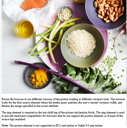
<p>Resize the browser to see different versions of the picture loading at different viewport sizes.
The browser looks for the first source element where the media query matches the user's current viewport width,
and fetches the image specified in the srcset attribute.</p>
<p>The img element is required as the last child tag of the picture declaration block.
The img element is used to provide backward compatibility for browsers that do not support the picture element, or if none of the source tags matched.
</p>
<p><strong>Note:</strong> The picture element is not supported in IE12 and earlier or Safari 9.0 and earlier.</p>
</body>
</html>
Output should be:

# Tips-2) When to use the Picture Element
There are two main purposes for the <picture> element:
1. Bandwidth
If you have a small screen or device, it is not necessary to load a large image file. The browser will use the first <source> element with matching attribute values, and ignore any of the following elements.
2. Format Support
Some browsers or devices may not support all image formats. By using the <picture> element, you can add images of all formats, and the browser will use the first format it recognizes, and ignore any of the following elements.
Example of the Picture Element
The browser will use the first image format it recognizes:
index.html
Example:
HTML
<!DOCTYPE html>
<html>
<head>
<meta name="viewport" content="width=device-width, initial-scale=1.0">
</head>
<body>

<h2>The picture Element</h2>

<picture>
  <source media="(min-width: 650px)" srcset="https://itupto.com/uploads/demo/2023-09-09-15-10-21-healthy-eating-ingredients-1296x728-header.jpg">
  <source media="(min-width: 465px)" srcset="https://itupto.com/uploads/demo/2023-09-09-15-03-42-2024-lamborghini-revuelto-127-641a1d518802b.jpg">
  <img src="https://itupto.com/uploads/demo/2023-09-09-15-03-42-2024-lamborghini-revuelto-127-641a1d518802b.jpg" style="width:auto;">
</picture>

<p>Resize the browser to see different versions of the picture loading at different viewport sizes.
The browser looks for the first source element where the media query matches the user's current viewport width,
and fetches the image specified in the srcset attribute.</p>

<p>The img element is required as the last child tag of the picture declaration block.
The img element is used to provide backward compatibility for browsers that do not support the picture element, or if none of the source tags matched.
</p>

<p><strong>Note:</strong> The picture element is not supported in IE12 and earlier or Safari 9.0 and earlier.</p>

</body>
</html>
Output should be: