|
Definition and Usage
The
A popover element will be invisible until it is invoked by another element. The other element must have a The popover element will be placed on top of all other content, and by clicking the popovertarget element, the popover element will toggle between showing and hiding: The popover element can be a single HTML element, or an entire section of HTML elements. See examples below. Applies to
The
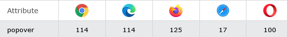
Browser Support
|
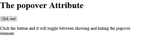
How to Add a <h1> element with a popover attribute, and a button to show/hide it - HTML popover Attribute
Click the button and it will toggle between showing and hiding the popover element.
index.html
Example:
HTML
<!DOCTYPE html>
<html>
<body>
<h1>The popover Attribute</h1>
<h1 popover id="myheader">Hello</h1>
<button popovertarget="myheader">Click me!</button>
<p>Click the button and it will toggle between showing and hiding the popover element.</p>
</body>
</html>
Output should be:
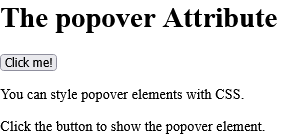
How to Use a DIV element as a popover element - HTML popover Attribute
You can style popover elements with CSS. Click the button to show the popover element.
index.html
Example:
HTML
<!DOCTYPE html>
<html>
<body>
<style>
#mydiv { text-align:center; padding:40px; background-color:lightblue; font-family:"Segoe UI", Tahoma, Geneva, Verdana, sans-serif;
}
</style>
<h1>The popover Attribute</h1>
<div popover id="mydiv"> <h2>Popover</h2> <hr> <p>A popover is an element that is placed on top of everything else.</p> <p>It can be used when you want to tell something important.</p> <button popovertarget="mydiv" popovertargetaction="hide">Close</button>
</div>
<button popovertarget="mydiv">Click me!</button>
<p>You can style popover elements with CSS.</p>
<p>Click the button to show the popover element.</p>
</body>
</html>
Output should be:
| html popover attribute |
| How to Add a <h1> element with a popover attribute, and a button to show/hide it - HTML popover Attribute | HTML Attribute |
| How to Use a DIV element as a popover element - HTML popover Attribute | HTML Attribute |
|
Type
: |
Develop |
|
Category
: |
Web Tutorial |
|
Sub Category
: |
HTML Attribute |
|
Uploaded by
: |
Admin |
Read Article
https://horje.com/learn/1434/reference