|
|
The HTML |
Example of HTML <button> Tag
It is A clickable button is marked up as follows.
index.html
<button type="button">Click Me!</button> Output should be:

Definition and Usage of HTML <button> Tag
Definition and Usage
The <button> tag defines a clickable button.
Inside a <button> element you can put text (and tags like <i>, <b>, <strong>, <br>, <img>, etc.). That is not possible with a button created with the <input> element!
Tip: Always specify the type attribute for a <button> element, to tell browsers what type of button it is.
Tip: You can easily style buttons with CSS! Look at the examples below or visit our CSS Buttons tutorial.
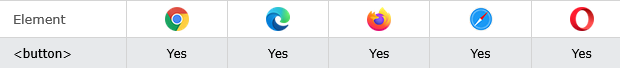
Browser Support of HTML <button> Tag
Attributes of HTML <button> Tag
| Attribute | Value | Description |
|---|---|---|
| autofocus | autofocus | Specifies that a button should automatically get focus when the page loads |
| disabled | disabled | Specifies that a button should be disabled |
| form | form_id | Specifies which form the button belongs to |
| formaction | URL | Specifies where to send the form-data when a form is submitted. Only for type="submit" |
| formenctype | application/x-www-form-urlencoded multipart/form-data text/plain |
Specifies how form-data should be encoded before sending it to a server. Only for type="submit" |
| formmethod | get post |
Specifies how to send the form-data (which HTTP method to use). Only for type="submit" |
| formnovalidate | formnovalidate | Specifies that the form-data should not be validated on submission. Only for type="submit" |
| formtarget | _blank _self _parent _top framename |
Specifies where to display the response after submitting the form. Only for type="submit" |
| popovertarget | element_id | Specifies a which popover element to invoke |
| popovertargetaction | hide show toggle |
Specifies what happens to the popover element when the button is clicked |
| name | name | Specifies a name for the button |
| type | button reset submit |
Specifies the type of button |
| value | text | Specifies an initial value for the button |
Global Attributes of HTML <button> Tag
The <button> tag also supports the Global Attributes in HTML.
Event Attributes of HTML <button> Tag
The <button> tag also supports the Event Attributes in HTML.
How to add A clickable button is marked up as follows
The button Element
index.html
<!DOCTYPE html>
<html>
<body>

<h1>The button Element</h1>

<button type="button" onclick="alert('Hello world!')">Click Me!</button>

</body>
</html>Output should be:

How to Use CSS to style buttons
The button element - Styled with CSS
Change the background color of a button with the background-color property:
index.html
 <!DOCTYPE html>
<html>
<head>
<style>
.button {
  border: none;
  color: white;
  padding: 15px 32px;
  text-align: center;
  text-decoration: none;
  display: inline-block;
  font-size: 16px;
  margin: 4px 2px;
  cursor: pointer;
}

.button1 {background-color: #04AA6D;} /* Green */
.button2 {background-color: #008CBA;} /* Blue */
</style>
</head>
<body>

<button class="button button1">Green</button>
<button class="button button2">Blue</button>

</body>
</html> Output should be:

How to Use CSS to style buttons (with hover effect)
The button element - Styled with CSS
Use the :hover selector to change the style of the button when you move the mouse over it.
Tip: Use the transition-duration property to determine the speed of the "hover" effect:
index.html
 <!DOCTYPE html>
<html>
<head>
<style>
.button {
  border: none;
  color: white;
  padding: 16px 32px;
  text-align: center;
  text-decoration: none;
  display: inline-block;
  font-size: 16px;
  margin: 4px 2px;
  transition-duration: 0.4s;
  cursor: pointer;
}

.button1 {
  background-color: white;
  color: black;
  border: 2px solid #04AA6D;
}

.button1:hover {
  background-color: #04AA6D;
  color: white;
}

.button2 {
  background-color: white;
  color: black;
  border: 2px solid #008CBA;
}

.button2:hover {
  background-color: #008CBA;
  color: white;
}

</style>
</head>
<body>

<button class="button button1">Green</button>
<button class="button button2">Blue</button>

</body>
</html> Output should be:

| html button |
Type: | Develop |
Category: | Web Tutorial |
Sub Category: | HTML Button |
Uploaded by: | Admin |
Read Articlehttps://horje.com/learn/1434/reference