
|
|
All popular CSS Frameworks offer responsive design. They are free, and easy to use. W3.CSSW3.CSS is a modern CSS framework with support for desktop, tablet, and mobile design by default. W3.CSS is smaller and faster than similar CSS frameworks. W3.CSS is designed to be independent of jQuery or any other JavaScript library. W3.CSS DemoResize the page to see the responsiveness! LondonLondon is the capital city of England. It is the most populous city in the United Kingdom, with a metropolitan area of over 13 million inhabitants. ParisParis is the capital of France. The Paris area is one of the largest population centers in Europe, with more than 12 million inhabitants. TokyoTokyo is the capital of Japan. It is the center of the Greater Tokyo Area, and the most populous metropolitan area in the world. |
HTML Responsive Web Design - Frameworks with W3css
index.html
Example:
HTML
<!DOCTYPE html>
<html>
<head>
<title>W3.CSS</title>
<meta name="viewport" content="width=device-width, initial-scale=1">
<link rel="stylesheet" href="https://www.w3schools.com/w3css/4/w3.css">
</head>
<body>

<div class="w3-container w3-green">
  <h1>W3Schools Demo</h1>
  <p>Resize this responsive page!</p>
</div>

<div class="w3-row-padding">
  <div class="w3-third">
    <h2>London</h2>
    <p>London is the capital city of England.</p>
    <p>It is the most populous city in the United Kingdom,
    with a metropolitan area of over 13 million inhabitants.</p>
  </div>

  <div class="w3-third">
    <h2>Paris</h2>
    <p>Paris is the capital of France.</p>
    <p>The Paris area is one of the largest population centers in Europe,
    with more than 12 million inhabitants.</p>
  </div>

  <div class="w3-third">
    <h2>Tokyo</h2>
    <p>Tokyo is the capital of Japan.</p>
    <p>It is the center of the Greater Tokyo Area,
    and the most populous metropolitan area in the world.</p>
  </div>
</div>

</body>
</html>
Output should be:

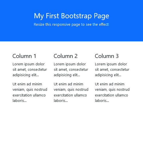
HTML Responsive Web Design - Frameworks with Boostrap
Another popular CSS framework is Bootstrap:
index.html
Example:
HTML
<!DOCTYPE html>
<html lang="en">
<head>
  <title>Bootstrap 5 Example</title>
  <meta charset="utf-8">
  <meta name="viewport" content="width=device-width, initial-scale=1">
  <link href="https://cdn.jsdelivr.net/npm/[email protected]/dist/css/bootstrap.min.css" rel="stylesheet">
  <script src="https://cdn.jsdelivr.net/npm/[email protected]/dist/js/bootstrap.bundle.min.js"></script>
</head>
<body>

<div class="container-fluid p-5 bg-primary text-white text-center">
  <h1>My First Bootstrap Page</h1>
  <p>Resize this responsive page to see the effect!</p>
</div>

<div class="container mt-5">
  <div class="row">
    <div class="col-sm-4">
      <h3>Column 1</h3>
      <p>Lorem ipsum dolor sit amet, consectetur adipisicing elit...</p>
      <p>Ut enim ad minim veniam, quis nostrud exercitation ullamco laboris...</p>
    </div>
    <div class="col-sm-4">
      <h3>Column 2</h3>
      <p>Lorem ipsum dolor sit amet, consectetur adipisicing elit...</p>
      <p>Ut enim ad minim veniam, quis nostrud exercitation ullamco laboris...</p>
    </div>
    <div class="col-sm-4">
      <h3>Column 3</h3>
      <p>Lorem ipsum dolor sit amet, consectetur adipisicing elit...</p>
      <p>Ut enim ad minim veniam, quis nostrud exercitation ullamco laboris...</p>
    </div>
  </div>
</div>

</body>
</html>
Output should be:
| What is HTML Responsive | HTML Responsive |
| How to Setting The Viewport | HTML Responsive |
| How to create HTML Responsive Images | HTML Responsive |
| How to create HTML Responsive Images Using the max-width Property | HTML Responsive |
| How to show Different Images Depending on Browser Width | HTML Responsive |
| How to create HTML Responsive Text Size | HTML Responsive |
| How to create Media Queries | HTML Responsive |
| How to create Responsive Web Page - Full Example | HTML Responsive |
| How to create HTML Responsive Web Design - Frameworks | HTML Responsive |
| HTML Responsive Web Design - Frameworks with W3css | HTML Responsive |
| HTML Responsive Web Design - Frameworks with Boostrap | HTML Responsive |
Read Full: | HTML Responsive |
Category: | Web Tutorial |
Sub Category: | HTML Responsive |
Uploaded by: | Admin |
Views: | 137 |
Reffered: https://www.w3schools.com/html/tryit.asp?filename=tryhtml_responsive_bootstrap